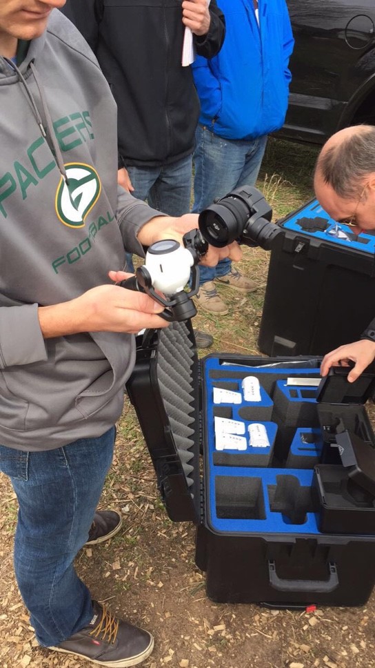
Wednesday, May 3, 2017

Assignment 11: Flying UAVs at South Middle School's Garden

Introduction

For this class, we headed south of UWEC about 10 minutes to Eau Claire's South Middle School Garden to fly the DJI Phantom 3 Advanced and the DJI Inspire a bit. This served as a visual and physical learning experience to see what actually goes into flying a UAV for geospatial analysis.

Methods

We arrived at the garden around 3 pm and first started by laying out the ground control points (GCPs). Since the garden was the area being flown, nine GCPs were laid out in three rows by three columns, ensuring to cover each corner of the garden. Figures 1 and 2 show the garden and a GCP placed within the garden's fence.

Figure 1: South Middle School's garden.

Figure 2: GCP laid out in garden.

The GCPs we used had numbers on them, so we made sure to put them in sequentially ordered snake pattern. From there, we used a survey-grade global positioning system (GPS) ground station that gave coordinates to the GCPs. Figure 3 shows a classmate using the GPS receiver to collect coordinates of a GCP.

Figure 3: Giving GCPs coordinates with ground station.
It was important to ensure that the coordinates were in the correct coordinate system (UTM) and that the GPS was centered over the GCP by using the balance on the receiver. After all of the GCPs were geolocated, flight was soon to come. Dr. Hupy prepared the Phantom for flight and set up the controller, explaining to the class what he was doing along the way. Before take-off, Dr. Hupy had noticed that the Phantom needed a software update and the UAS would not let us fly until the update was completed. This brought up an interesting, but real-world mishap. Luckily, we had our own wi-fi signal and we were able to complete the update while we set up the DJI Inspire.

Figure 4: "Mi-Fi" personal Wi-Fi hotspot.

Finally, after completing the software update, the Phantom was ready to fly. Here is a video of the phantom's take-off from the first flight:


The first flight was an aerial coverage of the garden, and the second flight was an oblique (camera set at 75 degrees) coverage of the class's cars. After two successful flights with the Phantom, we moved to the DJI Inspire; a bit heavier and more powerful UAV. Figure 5 shows a classmate attaching the rotor blades on the Inspire and figure 6 shows a classmate holding the two different sensor options we have for the Inspire.

Figure 5: Attaching rotor blades to Inspire.

Figure 6: Two sensor options for the DJI Inspire.
The Inspire was put into the air and manually controlled. The flight did not collect any imagery, however. Each classmate got a chance to fly the drone for a short period, applying the skills we've learned from the real flight simulator.

Results

The imagery from the first flight was processed in Pix4D, and produced an orthomosaic and digital surface model.

Figure 7: Orthomosaic map produced with imagery from flight one.

Figure 8: Digital Surface Model map produced with processed imagery from flight one.

Discussion


Looking at figure 7, the orthomosaic imagery offers a fairly crisp and detailed rendering of the garden, and the different agricultural plots are distinct and identifiable. I chose not to include the basemap as the orthomosaic image was inaccurately placed in some parts of the extent. This is interesting, because in the digital surface model (DSM) displayed in figure 8, the imagery appears to line-up fairly well with the basemap. Some of the color displayed in the imagery is a bit off as well, specifically the ground beneath the trees that line the garden. The image makes these areas appear a vibrant maroon-ish color, when in actuality, these areas are not as saturated.

Looking at figure 8, the trees (shown in bright red) are a bit distracting to the area of interest; the garden. While an accurate representation of the surface elevation, the sheer height of the trees takes away some of the elevation exaggeration that could be present in the garden. It is interesting to see the slight elevation change near the east side of the imagery, however. The DSM did turn out quite well, despite the somewhat interfering tree line, and shows in great detail the surface elevation of the area.

Overall, being able to see the entire process of analyzing data collected from a UAV was incredibly exciting and engaging. Everything from making the GCPs used in the field, to flying the drones, and processing the imagery, really puts the whole process into perspective.

Assignment 10: Making Ground Control Points

Introduction

For this assignment, the task was to make ground control points (GCPs) for field use of future UAS flights. The GCPs were constructed from 4' x 8' sheets of high density polyethylene. This material was used so that if the GCPs were left in the elements, they wouldn't damage like wood or some other material. The polyethylene is also relatively cheap, heavy enough that it won't move from wind, and still lightweight enough to easily transfer to a site and place.

Methods

After all was said and done, 16 GCPs were made. The first step was to cut the sheets into 8 equal squares. This was done with a table saw (figure 1).

Figure 1: Cutting polyethylene sheet.
 After the squares were cut out, a plywood triangle template was used along with magenta-colored spray paint. The template was used twice, on either side of each GCP, to create an easily distinguishable "X" on the square. From there, a number was added to the remaining black portions of the GCP so that the GCP can be easily referenced when processing the imagery.

Figure 2: Painting the GCPs.
The GCPs were left to dry for 24 hours or so, and now are ready to be used in the field.

Discussion

Overall, the process of making GCPs with Dr. Hupy was fairly easy and enjoyable. In total, there were around 12-13 people, so probably "too many cooks in the kitchen". Nonetheless, it took around 45 minutes to make 16, good looking GCPs, so the process was fast and easy.

Monday, April 24, 2017

Assignment 9: Mission Planning with C3P

Introduction

The purpose of this assignment was to learn about proper mission planning when it pertains to flying a UAV. To do this, C3P Mission Planning Software was used which ensures a safe and effective UAV flight plan. Throughout this assignment, all of the proper steps to planning any UAV mission will be discussed as well as potential issues and solutions to using the C3P Mission Planning software.

Methods

Mission Planning Essentials

The first step in planning any UAV mission is to examine the study site. By looking at maps, 3D models, or, better yet, physically going to the site, the pilot can make note of any potential hazards such as power lines, radio towers, buildings, terrain, and crowds of people. It is also important to note whether there will be wireless data available or not. If not, then the pilot will need to cache the data obtained from the flight. Once observation has taken place and potential hazards/obstacles are noted, the pilot can now start to plan the mission. Using any geospatial data available and drawing out multiple potential mission plans (using C3P Mission Planner in this case) is best practice. Then, checking that the weather is suitable for flying a UAV and ensuring that all required equipment is fully charged and ready to go are the last steps required before the pilot is well prepared for the mission.

Once the pilot is ready to depart, a final weather and equipment check should be done. If the forecast appears suitable for a UAV flight and all of the necessary equipment is packed, the pilot is prepared to head out to the site.

At the site, before the pilot is ready takeoff a few final steps should be completed; the first being site weather. The pilot should document the wind speed and direction, temperature, and dew point of the study site. From there, the pilot should assess the field's vegetation; terrain; potential electromagnetic interference (EMI) from power lines, underground metals/cables, power stations, etc; and launch site elevation. Lastly, the units the team will be working in should be established and standard throughout the project thereafter, the mission/s should be reevaluated given any unforeseen characteristics of the site, the network connectivity should be confirmed, and all field observations should be documented in the pre-flight check and flight log.

Once all of these steps have been completed, the pilot is ready to fly.

Using the C3P Mission Planning Software

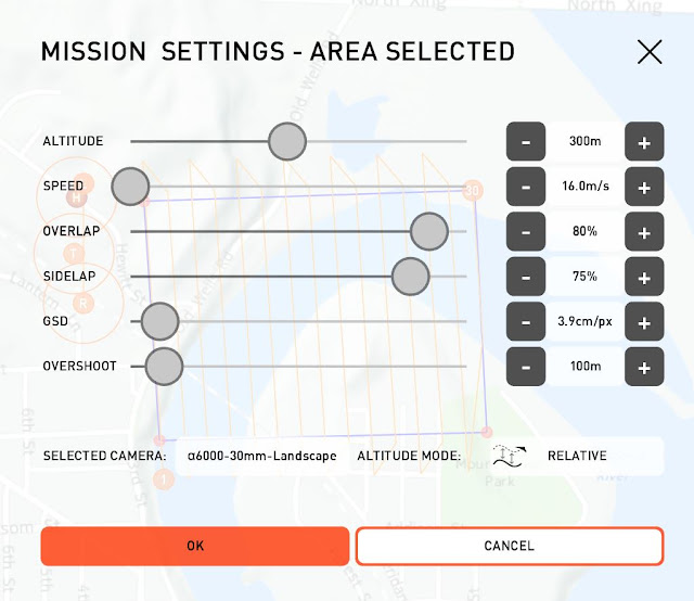
The first step to create a mission plan in C3P is to relocate the "home", "takeoff", "rally", and "land" locations to the study site on the map. Next, the user will draw a flight path using the draw tool. Depending on the individual site, the user can draw the path by point, line, or area. The tool also has a measurement option for precise flight path drawing. Once the user has drawn the flight path, the mission settings are adjusted. The mission settings include altitude, UAV speed, frontal and side overlap, ground sampling distance (GSD), overshoot, and camera type (figure 1).

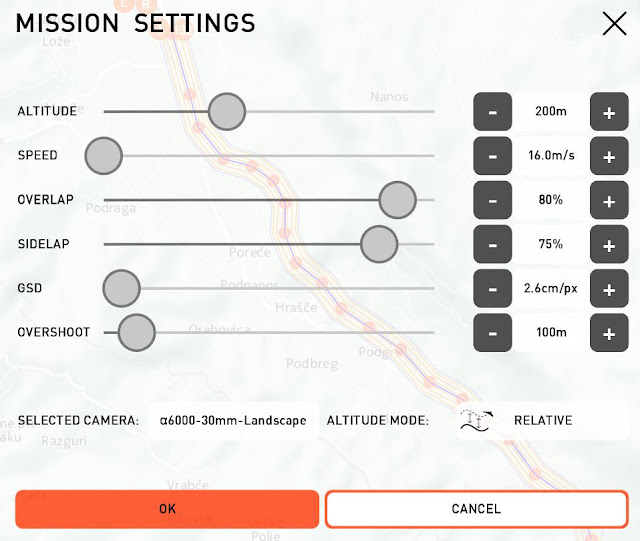
Figure 1: Mission plan settings.
It is important to note that the recommended frontal overlap for any UAS flight capturing geographic imagery should be upwards of 70 percent and the recommended side overlap should be upwards of 60 percent. However the altitude (either relative or absolute), speed, GSD, overshoot, and camera type are all relative to the individual project. Relative altitude refers to the altitude above the surface and is recommended when flying sites that have large changes in surface elevation (ie. the Bramer Test Field or Mt. Simon). Absolute altitude refers to the altitude above the launch point. If absolute altitude is selected, the UAV will fly at the exact same height for the duration of the flight. Speed refers to the actual distance traveled over time by the UAV during the flight. The GSD refers to the image resolution and is automatically adjusted according to the other settings. The default GSD value is usually left alone. Overshoot refers to the turn around distance outside of the flight area. This setting is adjusted based on the type of UAV, the speed at which it's flying, the wind speed/direction, and to ensure proper amounts of overlap are being achieved in the flight area. Lastly, the user has the option to choose their type of camera that will be used in the actual flight. This also adjusts the GSD settings.
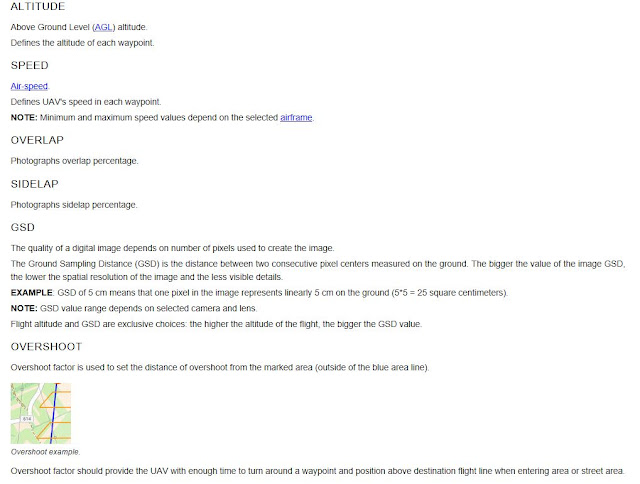
Figure 2: More about the mission settings from the C3P help bar. 
Potential Issues When Mission Planning

After the user has drawn their flight area and has adjusted the settings, it is important to look at the map view and the 3D View to ensure the most effective flight path orientation is being used and that there aren't any obstructions in the flight path.

Figures 3 and 4 show two different orientations of the same flight path. The orientation is relative to each flight, but these images help to show the orientation of any flight plan can be adjusted. To do so, the boarder with the desired direction of flight is selected (the yellow boarder in figures 3 and 4).
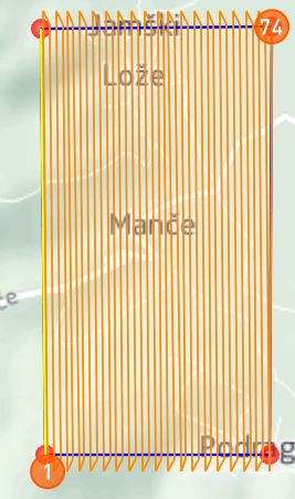
Figure 3: Vertical Orientation
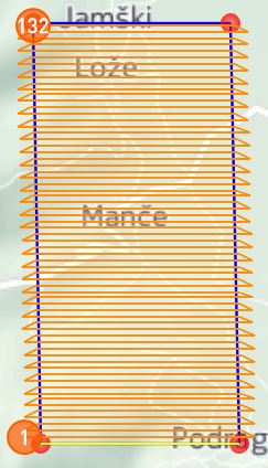
Figure 4: Horizontal Orientation
Figures 5 and 6 show a potential issue associated with choosing the absolute altitude function in the mission settings. In Figure 5, the red-orange areas on the right side of the flight represent obstructions in the flight plan, in this case a mountain side. This issue is more visible in figure 6, which shows the 3D view of the flight. The red mask applied to the surface represents the flight area and the orange lines represent the UAV flight path. The obstruction area from figure 5 is the same as the red area on the mountain side in figure 6. The mountain side obstructs the flight path and would crash the UAV if flown with these settings. This is why it is important to check that there are no obstructions in the flight path before verifying it. 
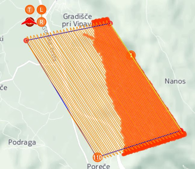
Figure 5: Map view showing a problematic mission plan using absolute altitude.
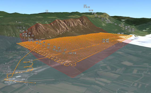
Figure 6: 3D view of the same mission plan.

Figures 7 and 8 show a corrected version of the flight path in figures 5 and 6, by using relative altitude instead of absolute. Notice how there are no red-orange areas demonstrating obstructions to the flight path in figure 7.
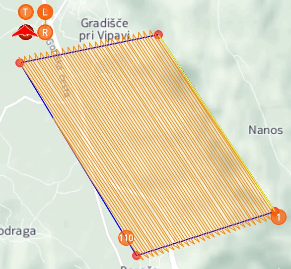
Figure 7: Map view showing acceptable mission plan using relative altitude.
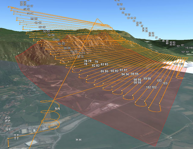
Figure 8: 3D view showing same mission plan.

 Another thing to look out for is altitude itself. When the user is ensuring that the flight is within FAA flight zone regulations and/or using absolute altitude, the flight height might require adjustments. In figures 9 and 10, the flights cover the same area. Notice in figure 9, the flight is obstructed by the hill in the far right corner and is set to and absolute altitude of 200 meters. In figure 10, however, the flight has no obstructions and was raised to an absolute altitude of 350 meters. 
Figure 9: 3D view of flight path set to 200 meters.
Figure 10: 3D view of flight path set to 350 meters.

Mission Planning Examples

Now that the user is comfortable with the software, two missions are created. One of which covers a road in Slovenia near the C3P default Baramor Test Field, and the other covers Mt. Simon and the Chippewa river in Eau Claire, Wisconsin. 

The first mission planned (figures 11 and 12) covers about 8 kilometers of a road in south west Slovenia. This path was drawn using the streets (line) draw tool and the home, takeoff, rally, and land points were all placed at the same end to ensure minimal travel distance from take off to landing. The relative altitude was set to 200 meters. 
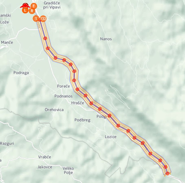
Figure 11: Map view of road flight.
Figure 12: 3D View of road flight.

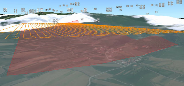
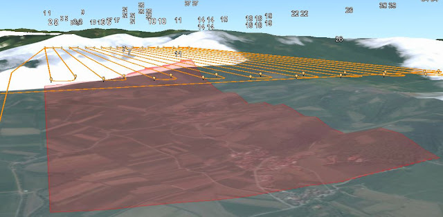
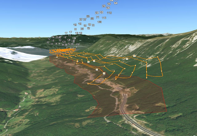
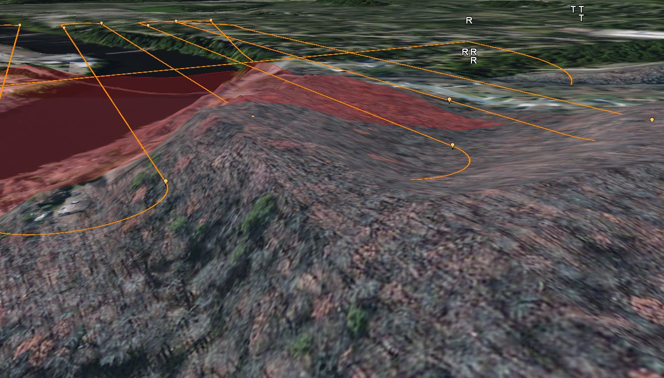
A second mission (figures 13, 14, 15, and 16) was created and covers roughly 581,000 square meters of the Chippewa river and surrounding bluffs in Eau Claire, WI. This path was drawn with the area draw tool and relative altitude was set to 300 meters. 
Figure 13: Mt. Simon mission settings.
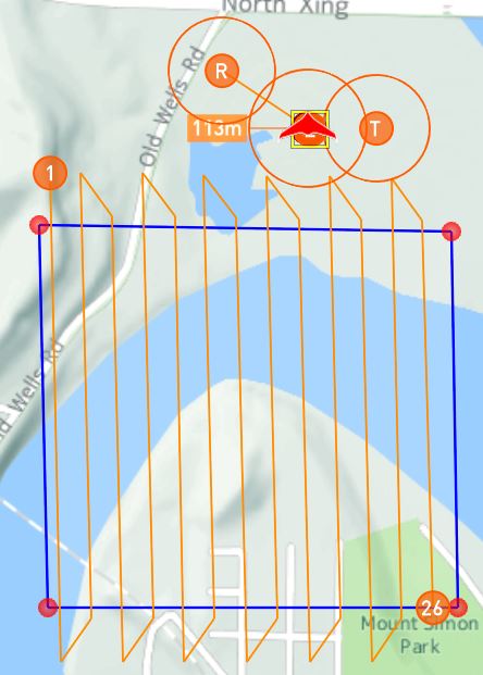
Figure 14: Map view of mission plan.
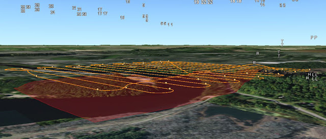
Figure 15: 3D view of mission plan.
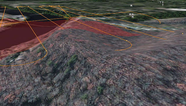
Figure 16: Close up of flight path obstruction in 3D view.

Although the mission altitude was set to be relative, there was an obstruction in the flight path (shown in figure 16) as well as no altitude variance throughout the mission plan (shown in figure 15). There are also no red-orange obstruction indicators in the map view. This is obviously problematic and could potentially mislead a user into thinking the mission plan would work when in actuality, it wouldn't. Again, it is important to verify the flight path in 3D viewer just in case an error like this occurs.

Discussion

Overall, the C3P Mission Planning software was extremely easy to use and can really help remote pilots in planning missions. I found that the user help guide was very easily navigable and helpful in understanding the software. The ability to set the wind speed and simulate the flight can provide the user a fairly accurate flight time and insight for path adjustments, assuming that other weather characteristics are suitable for flight. Also, having the software connect to ArcGIS Earth was very useful in validating the mission plan and seeing the flight path as you would in the field. I'm not sure, however, why the relative altitude setting was ignored by the software in flight two. It might have something to do with the spatial reference or system of measurement (imperial vs metric), but I really don't know. Another downside to this software is the flashing sensor calibration and upload way-points indicators. They are set up to stop the user from initializing the flight simulator before calibrating the sensor and uploading the waypoints. I found them to be a bit distracting when using the software and would prefer if there was a warning pop-up window, telling the user to ensure that the waypoints are uploaded and the sensor is calibrated.

Monday, April 17, 2017

Assignment 8: Oblique Imagery

Introduction

The objectives of this assignment were to take oblique imagery of 3-D objects, process the images, and engage in annotation which resulted in enhanced 3-D models of the objects. Oblique imagery is obtained by flying a UAV in a circle around the object being photographed usually at an angle so that the camera is pointed at the object. Annotation is manually correcting the images so that Pix4D knows which parts of each image are the 3-D object and which parts are background. Then, in theory, the 3-D model of the object can become a more accurate representation than before. For this assignment, oblique imagery of a shed, a bulldozer, and a pickup truck were processed and annotated.

Methods

The first step for engaging in annotation of oblique imagery was to process the images for each flight. Initial processing is all that is required to annotate the imagery, however one was processed fully to be used for comparison between 3-D models with annotation and without. Once initial processing was complete, the next step was to annotate the imagery. To do this, the rayCloud viewer was turned on and the drop down menus from Cameras>Calibrated Cameras were selected (figure 1).

Figure 1: Camera sidebar from rayCloud viewer window and annotated image of pickup truck.
For each of the objects, five images were annotated; one from each side and one from the highest point above the object in the dataset. The properties box on the right side of figure 1 was where the annotation took place. Figures 2 and 3 show a screen-grab of the properties window before and during annotation.

Figure 2: Before annotation.
Once the image was selected, the annotation icon (highlighted pen in figure 2) was clicked and Pix4D then segmented the image to prepare for it annotation.
Figure 3: During annotation.
In figure 3, masked areas are magenta and these are the areas that were already annotated. Annotation was done by clicking and dragging the mouse around the image until the object of interest was the only thing left  not masked. This was repeated four times at different angles and the second and third processing steps were completed, using the annotation to better enhance the 3-D model generated. 

Results


 The first video shows a "fly with me" animation of the annotated shed imagery.

The second video shows a "fly with me" animation of the annotated bulldozer imagery.


The third video shows a "fly with me" animation of the truck imagery without using annotation.


The fourth video shows a "fly with me" animation of the annotated truck imagery.

Discussion

After the processing and annotating was complete it was clear that annotation wasn't of much help in bettering the quality of the 3D models. This could be for many reasons, one of which being that, with the exception of the shed, the imagery was already about as good as it could be. There is the potential to take better quality imagery in the first place, but for what it's worth, the dataset produced some fairly high quality 3D models even before annotation was brought into the mix. Perhaps annotating more than four to five images per model would enhance the quality as well, for instance, the discolored blob on top of the track shed. When looking at the shed's images, more of them contained open sky than in the other datasets. This means that the dataset could require more annotation in order to ensure that the open sky is not a part of the model and eliminates confusion in Pix4D's 3D model builder. Another noticeable defect, not corrected by annotation, was seen in the truck and bulldozer models. Underneath the pickup truck would most likely be transparent in reality and the wheels of the bulldozer would most likely be opaque in actuality.

Sources:
https://support.pix4d.com/hc/en-us/articles/202560549-How-to-Annotate-Images-in-the-rayCloud#gsc.tab=0

Monday, April 10, 2017

Assignment 7: Calculating Volumes

Introduction

In this assignment, the objective was to learn about calculating volumetric data of stockpiles at the Litchfield mine with Pix4D and ArcMap. Now that processing imagery, using GCPs, and creating DSMs and Orthomosaics are familiar, this lab will expand on that knowledge to produce some extremely useful volumetric data. Calculating volumes of a given object could be extremely useful in mining operations or mineral/ gravel businesses for determining how much product they have in their stockpiles.

In order to perform the analysis, the following tools were used in ArcMap:

Extract by Mask - this tool works much like a clip tool in that the user puts in an input raster and a clip extent, known as the "mask" in this tool's name. The feature mask can be a raster or feature dataset.

Raster to TIN - a tool used to convert raster files to a triangulated irregular network (TIN) dataset. The tool works by taking the original raster file's z-values and creating a triangular representation of the (usually digital elevation model [DEM]) within a certain z-tolerance (allowable difference between z-values of raster and the generated TIN).

Add Surface Information - this tool adds information about a certain raster, TIN, or terrain surface's surface elevation properties (specified by the user) to the attribute table of the input feature class. This tool can add z values, z minimum values, z maximum values, z mean values, surface area, slope length, minimum slope, maximum slope, and average slope.

Surface Volume - a tool used for calculating the area and volume of an area between a surface plane (raster, TIN, or terrain surface) and the reference plane (layer's spatial reference). The user has the option to calculate volumes above or below the reference plane.

Polygon Volume - similar to the surface volume tool, this tool calculates the volume and surface area between a polygon feature class and a terrain or TIN surface. The volumes and surface area calculations extend as far as the dimensions of the polygon go. The user again has the option to calculate volumes above or below the reference plane.

Cut Fill - this tool is used to determine differences in surfaces over time. The tool works by comparing the surfaces of two separate surface datasets (raster, TIN, terrain surface) and then calculating the volumes of difference between the two datasets.

Methods

Once the tools in the previous list were familiar, the calculating volumes process could begin. The first step was to process the imagery of the mine flight. Since the mine imagery had already been processed (and with GCPs) in a previous assignment, that Pix4D file was used. First, the volumes tab for the orthomosaic was opened and the new volume button was chosen. The next step was to digitize around the stockpiles and calculate volumes. In figure 1, the calculated volumes are shown in the windows on the left-hand side of the image. The digitized stockpiles are shown on the right-hand side.
Figure 1: Digitized stockpiles and calculated volumes.
Once this step was completed, the volumes were exported as shapefiles to be used in ArcMap. The next step was to use the newly-created polygon shapefiles and the DSM created from processing in ArcMap. The extract by mask tool was used for each of the three stockpiles, placing the DSM as the input raster and the three stockpile polygons as the feature mask data (figure 2).
Figure 2: Extract by mask step.
 Three clipped stockpile rasters were made and the next step was to calculate the surface volume. This was done using the surface volume tool. An area outside of each stockpile was selected as the reference plane/ surface to compare the stockpile z-values to. Figure 3 shows the tool inputs box. The green dot shows the identity point clicked to get the surface area value (shown in the identity dialog box). This value was entered as the plane height in the surface volume tool.
Figure 3: Surface Volume tool.
This was done for all three of the piles and three respective tables were made, giving the volume of the piles above the height entered for each of the points. Figure 4 shows the output table from the surface volume tool for stockpile 1.
Figure 4: Surface Volume output table.
From there, the raster to tin tool was used for each of the stockpiles. In figure 5, the third stockpile clip was used as the input raster, the output TIN file name and locations was specified, and the rest of the defaults were kept. This tool produced the two colored stockpiles on the left side of the image.
Figure 5: Raster to TIN tool.
Lastly, the Add Surface Information tool was used; placing the newly-created TIN files as the input surface. The original stockpile polygons were used for the input feature classes and also were where the resulting surface information was stored. The Z_MIN and Z_MEAN output properties were selected, but the Z_MIN is the only necessary property for the purpose of this analysis.
Figure 6: Add Surface Information tool.
Results

Two maps were made from the information obtained throughout the analysis and a table containing the volumes of the three stockpiles from each of the methods used to calculate these volumes was created. The first map, figure 7, is one that shows the locations of each stockpile used with the DSM shown underneath.
Figure 7: A map showing the locations of each stockpile used in this analysis.
 The second map, figure 8, shows the TIN outputs of each stockpile. Notice the differences in class elevation values between the piles.
Figure 8: A map showing the TIN elevations of each stockpile used in this analysis.
Figure 9 is a table that compares the three methods used and they're respective volumes.
Figure 9: Volume methods table in meters squared.
Discussion

Looking at the methods, these calculations were fairly easy to execute and the tool interface was quite user-friendly, which means calculating this very useful information could be learned by many and is easily accessible. Having a variety of calculation methods is also useful for applications in which the user might only have access to certain software or extensions within the software (ie. the 3D Analyst extension was used to access the Surface Volume tool in ArcMap). This technology could be extremely useful for mining, shipping, and other similar operations for ensuring accurate stock management or land use. Ensuring that the entire pile, as well as some area outside of the pile, is digitized is crucial to accurate volumetric data. In figure 7, it is clear that some of the area around pile 2 was left out of the shapefile and therefore the calculation. When digitizing in Pix4D, I found it difficult to determine the piles' extents and felt it might have been more accurate if I digitized the piles using the DSM in ArcMap instead. Otherwise it seems that all of the calculations are fairly similar to eachother, however I personally feel that the Surface Volume tool could yield the most accurate results. Because the Surface Volume tool uses a plane height specified by the user combined with a DEM or DSM, the volumes derived from that would be more accurate than just using the shapefile for the calculation extent combined with a raster or TIN, like one would with the Add Surface Information tool. In this assignment the TIN was used for the Add Surface Information and I feel as though that had an impact on the accuracy of the volume calculated, because the TIN file is not a direct representation of the surface, but rather a modified and simplified version. All in all, each tool for calculating volumes has the potential to serve its purpose in the specific parameters of the task and each tool was quite easy to use while also producing useful information.


Monday, March 27, 2017

Assignment 6: Processing Multispectral Imagery

Introduction

The goal of this assignment was to work with processing multi-spectral imagery in Pix4D and using that imagery to complete a value added data analysis of vegetation health for a site in Fall Creek, Wisconsin.

The camera used to capture the imagery for this assignment was a MicaSense RedEdge 3. This camera is capable of taking five photographs in five different spectral bands. This technology allows for more precision in agriculture and vegetation analysis than a standard RGB sensor. The five different bands in order from shortest wavelength to longest are as follows: band 1 is the blue filter, band 2 is the green filter, band 3 is the red filter, band 4 is the red edge filter, and band 5 is the near infrared (NIR) filter. The RedEdge camera also requires specific parameters for proper image capturing and analysis. The following table (table 1) is a list of those parameters from the RedEdge user manual.

Table 1: MicaSense RedEdge 3 sensor parameters

Methods

The first step for this assignment was to process the flight imagery taken from the site in Pix4D. This was done using the same methods as previous assignments, however this time, the Ag Multispectral template was used. This creates five orthomosaic geotiffs, one for each of the spectral bands. In figure 1, the template is shown to be set to Ag Multispectral. This didn't automatically produce the orthomosaics that were needed for further analysis, so the orthomosaic geotiff and subsequent options were checked.

Figure 1: Pix 4D processing options

Once processing concluded, the next step was to compose all five of the spectral bands into one RGB orthomosaic. To do this, the various geotiffs for each of the bands were brought into ArcMap and the "composite bands" tool was used. This tool works by entering each of the five spectral bands as input rasters. Then the user simply assigns a name and location to the output raster and the composite is created.

Figure 2: Composite Bands tool in ArcMap

After the composite raster was created, the raster was copied twice to produce a false color infrared orthomosaic and a red edge orthomosaic in addition to the original RGB orthomosaic. To adjust the original RGB orthomosaic, the layer properties' symbology tab was used. The bands were adjusted to show various light filters and better analyze vegetation for the site (figures 3 and 4).

Figure 3: Adjustments to the symbology in the layer properties for the RGB composite
Figure 4: Various composite layers
Three maps were then produced in ArcMap with the different multispectral layers (see results section). From there, the next step was to perform a value added data analysis in ArcGIS Pro. This analysis shows permeable and impermeable surfaces for the given site. To do this, steps for value added data analysis from assignment 4 were used in conjunction with the data from this assignment.

The first step was to segment the imagery (figure 5). This makes the spectral band values less complex and better helps the user break up the imagery into permeable and impermeable surfaces. Segmenting the imagery in ArcGIS Pro was done by bringing in the composite raster and following the prompts from the tool.


Figure 5: Segmented Imagery


After the imagery was segmented, the next step was to classify the imagery into different surfaces. This was done by looking at the composite image and assigning areas to certain classes (figures 6 7, and 8). The five classes chosen were: roads, cropland, grass, shadows, and house/car.

Figure 6: Surface classification

Figure 7: Training sample manager with 5 custom classes

Figure 8: Result of classification
After the imagery was classified, the final step was to undergo reclassification in which the classified imagery was categorized into pervious and impervious surfaces (aka permeable impermeable surfaces). This was done by entering values of 0 for impervious surfaces and 1 for pervious surfaces (figure 9 and table 2).
Figure 9: Reclassify tool

Table 2: Pervious and impervious reclassification 
This resulted in a value added rendering of the original data which was used to make a map showing the pervious and impervious surfaces of the site.

Lastly, a normalized difference vegetation index (NDVI) map was created. This map shows health of vegetation, and is analyzed in a similar way to the false color maps made for this assignment. Since the Ag Multispectral template was used when processing the imagery in Pix4D, an NDVI raster was produced. The map was made by layering the NDVI with the DSM also produced in Pix4D and using a hillshade effect.

Results
Map 1: RGB Orthomosaic

Map 1 shows a conventional red, green, and blue band orthomosaic image. Due to combining the images of each color band together and having somewhat poor images to work with, some of the areas on the map appear to contain more red hues than in real life. Still, the viewer can make out what objects in the image represent and can interpret the "pinkish" grass-covered area in the southern portion of the image as an area with poor vegetation health. If these areas contained healthy vegetation, they would most likely be green, much like the crop field on the western portion of the map. Since this image is in a standard RGB display, there is a possibility of the poor vegetation areas and the unusual pink hue shift being attributed to the quality of the images taken in this flight. Perhaps a different color band rendering will help to determine uncertainties with map 1.
Map 2: False color map using RedEdge band

The MicaSense RedEdge 3 stands tall in terms of understanding vegetation health. Because the sensor is capable of taking images in five distinct spectral bands, the user is able to produce more definitive false color imagery like that of map 2. In map 2, band 4 (red edge); band 3 (red); and band 2 (green) were used instead of red, green, and blue like in map 1. Using these particular bands in this order shows highly reflective areas (a.k.a. areas of healthy vegetation) as red; this would be the reasoning for the term "false color", and poorly reflective areas/areas of poor vegetation health as green. In the map above, areas such as the hedges between the two properties on the northern edge of the map, trees, and the owner's lawn are saturated with red. Recalling speculations about the previous map about vegetation health, the unkempt grassy area covering the southern portion of the map and other speckled areas containing pink, unhealthy vegetation are verified by this map. 
Map 3: False color map using near infrared band

Comparing map 3 to map 2, there isn't much difference between the two. Both are false color renderings except, one uses the RedEdge band and the other uses the near IR band. Using the near IR band saturates the areas of healthier vegetation even further. It appears this helps to distinguish large areas of healthy vegetation from large areas of unhealthy vegetation, however some of the finer detail in vegetation health variance is lost by this saturation. The hedge between the two properties and the unkempt area to the right of the homeowner's lawn are good examples of this loss due to color saturation.
Map 4: Value Added Pervious and Impervious Surfaces

In map 4, areas in blue show pervious (or permeable) surfaces and areas of khaki show impervious (or impermeable) surfaces. Some of the impervious areas near the top right of the map are in fact pervious, but ArcGIS Pro interpreted them as being impervious. This could be due to the quality of the imagery or user error when classifying the segmented imagery. Also, the entire boarder surrounding the image got accounted for as an impervious surface, however this area shouldn't have been included.
Map 5: NDVI raster
The fifth and final map of this analysis is of course map 5. Because the Ag Multispectral template was used in the image processing with Pix4D, an NDVI raster was produced. With the gradient used for this map, features of the landscape become enriched and areas of poor vegetation health are shown in a rusty red color while areas of good vegetation health are shown as indigo. Over larger portions of vegetation with similar health, such as the southern area of grass, the user is able to see in great detail variances in vegetation health. There also seems to be minimal false interpretations of values in this map with the only real exception being the shadow cast by the house.

Conclusions

It is clear that using the Ag Multispectral template in Pix4D as well as the MicaSense RedEdge 3 sensor is a fantastic option for farmers, biologists, golf course management, and other similar applications. This technology allows the user to really gain an in depth analysis of the health of their vegetation. Set backs to this technology would include the large potential for false information from user error. During the flight that collected the images used for this analysis, the pilot accidentaly had the camera on while the UAV was climbing to its planned flight altitude. Mishaps such as this have an effect on the quality and accuracy of the analysis. If I could do this assignment over again, a potential fix for this mistake could be to eliminate those images from processing altogether. If images from UAV are taken with great care and accuracy and the user completes all the data manipulation steps correctly, this technology has the potential to provide cutting edge agricultural and other vegetation-based information analysis.