Monday, March 27, 2017

Assignment 6: Processing Multispectral Imagery

Introduction

The goal of this assignment was to work with processing multi-spectral imagery in Pix4D and using that imagery to complete a value added data analysis of vegetation health for a site in Fall Creek, Wisconsin.

The camera used to capture the imagery for this assignment was a MicaSense RedEdge 3. This camera is capable of taking five photographs in five different spectral bands. This technology allows for more precision in agriculture and vegetation analysis than a standard RGB sensor. The five different bands in order from shortest wavelength to longest are as follows: band 1 is the blue filter, band 2 is the green filter, band 3 is the red filter, band 4 is the red edge filter, and band 5 is the near infrared (NIR) filter. The RedEdge camera also requires specific parameters for proper image capturing and analysis. The following table (table 1) is a list of those parameters from the RedEdge user manual.

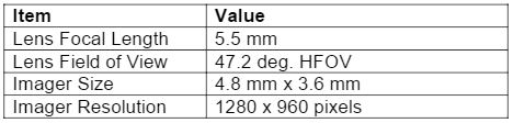
Table 1: MicaSense RedEdge 3 sensor parameters

Methods

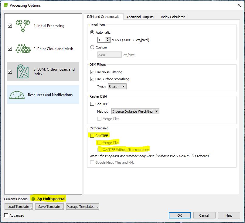
The first step for this assignment was to process the flight imagery taken from the site in Pix4D. This was done using the same methods as previous assignments, however this time, the Ag Multispectral template was used. This creates five orthomosaic geotiffs, one for each of the spectral bands. In figure 1, the template is shown to be set to Ag Multispectral. This didn't automatically produce the orthomosaics that were needed for further analysis, so the orthomosaic geotiff and subsequent options were checked.

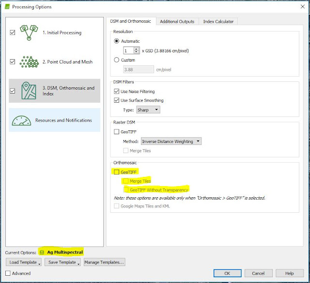
Figure 1: Pix 4D processing options

Once processing concluded, the next step was to compose all five of the spectral bands into one RGB orthomosaic. To do this, the various geotiffs for each of the bands were brought into ArcMap and the "composite bands" tool was used. This tool works by entering each of the five spectral bands as input rasters. Then the user simply assigns a name and location to the output raster and the composite is created.

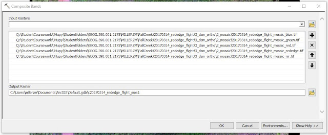
Figure 2: Composite Bands tool in ArcMap

After the composite raster was created, the raster was copied twice to produce a false color infrared orthomosaic and a red edge orthomosaic in addition to the original RGB orthomosaic. To adjust the original RGB orthomosaic, the layer properties' symbology tab was used. The bands were adjusted to show various light filters and better analyze vegetation for the site (figures 3 and 4).

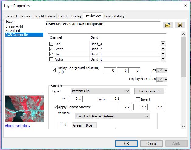
Figure 3: Adjustments to the symbology in the layer properties for the RGB composite
Figure 4: Various composite layers
Three maps were then produced in ArcMap with the different multispectral layers (see results section). From there, the next step was to perform a value added data analysis in ArcGIS Pro. This analysis shows permeable and impermeable surfaces for the given site. To do this, steps for value added data analysis from assignment 4 were used in conjunction with the data from this assignment.

The first step was to segment the imagery (figure 5). This makes the spectral band values less complex and better helps the user break up the imagery into permeable and impermeable surfaces. Segmenting the imagery in ArcGIS Pro was done by bringing in the composite raster and following the prompts from the tool.


Figure 5: Segmented Imagery


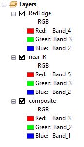
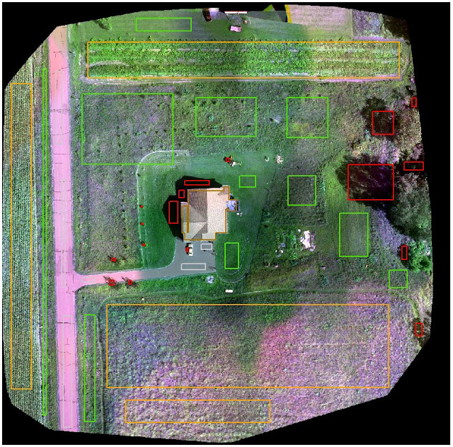
After the imagery was segmented, the next step was to classify the imagery into different surfaces. This was done by looking at the composite image and assigning areas to certain classes (figures 6 7, and 8). The five classes chosen were: roads, cropland, grass, shadows, and house/car.

Figure 6: Surface classification

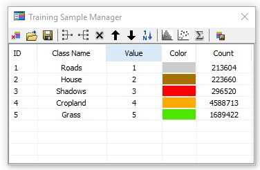
Figure 7: Training sample manager with 5 custom classes

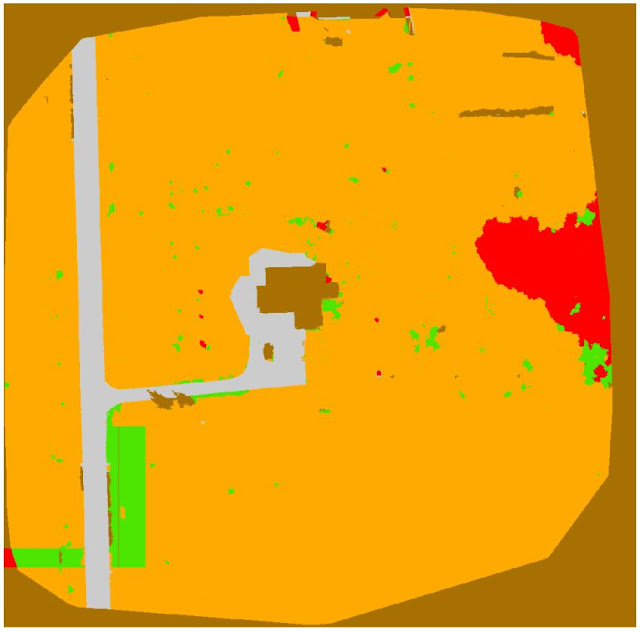
Figure 8: Result of classification
After the imagery was classified, the final step was to undergo reclassification in which the classified imagery was categorized into pervious and impervious surfaces (aka permeable impermeable surfaces). This was done by entering values of 0 for impervious surfaces and 1 for pervious surfaces (figure 9 and table 2).
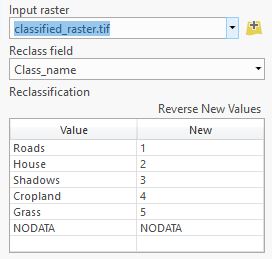
Figure 9: Reclassify tool

Table 2: Pervious and impervious reclassification 
This resulted in a value added rendering of the original data which was used to make a map showing the pervious and impervious surfaces of the site.

Lastly, a normalized difference vegetation index (NDVI) map was created. This map shows health of vegetation, and is analyzed in a similar way to the false color maps made for this assignment. Since the Ag Multispectral template was used when processing the imagery in Pix4D, an NDVI raster was produced. The map was made by layering the NDVI with the DSM also produced in Pix4D and using a hillshade effect.

Results
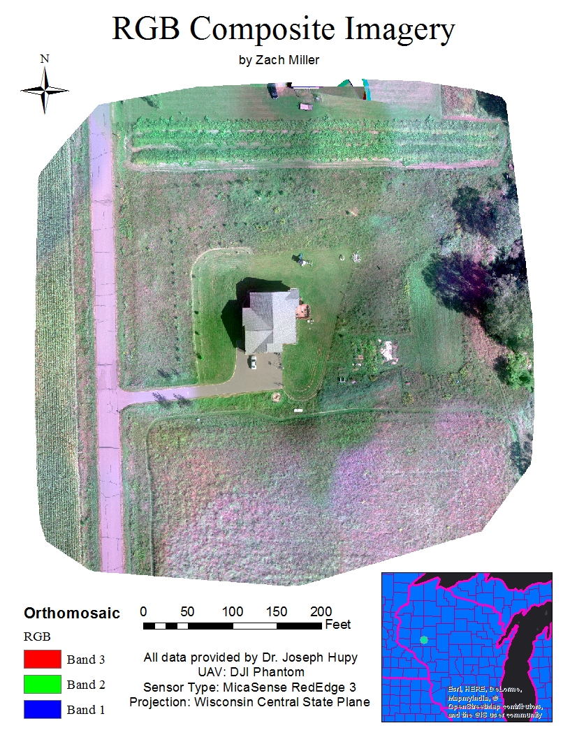
Map 1: RGB Orthomosaic

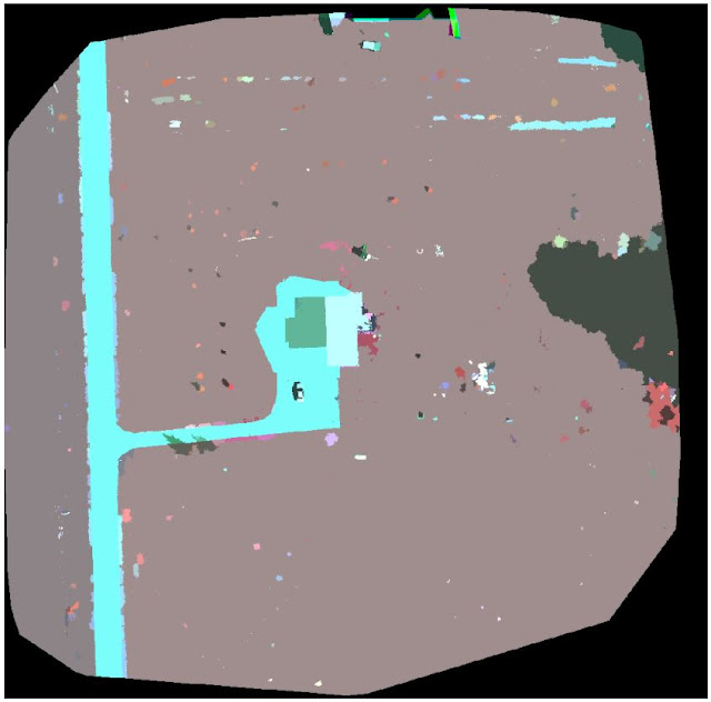
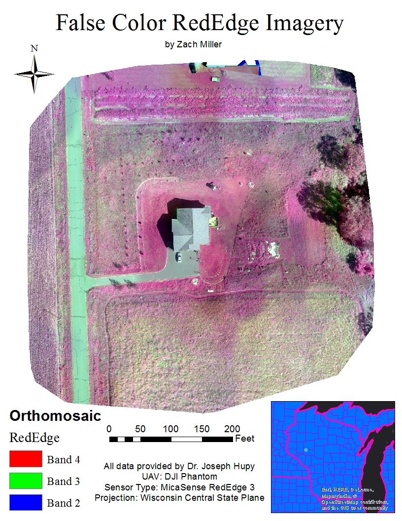
Map 1 shows a conventional red, green, and blue band orthomosaic image. Due to combining the images of each color band together and having somewhat poor images to work with, some of the areas on the map appear to contain more red hues than in real life. Still, the viewer can make out what objects in the image represent and can interpret the "pinkish" grass-covered area in the southern portion of the image as an area with poor vegetation health. If these areas contained healthy vegetation, they would most likely be green, much like the crop field on the western portion of the map. Since this image is in a standard RGB display, there is a possibility of the poor vegetation areas and the unusual pink hue shift being attributed to the quality of the images taken in this flight. Perhaps a different color band rendering will help to determine uncertainties with map 1.
Map 2: False color map using RedEdge band

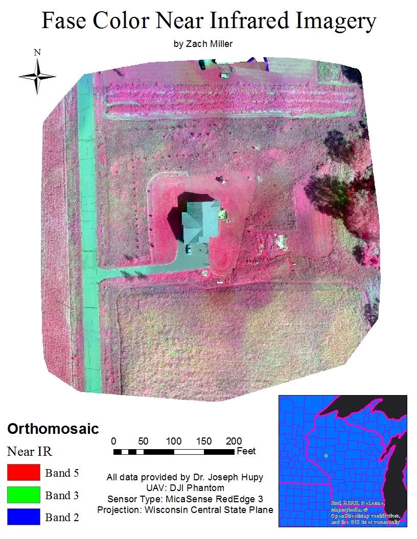
The MicaSense RedEdge 3 stands tall in terms of understanding vegetation health. Because the sensor is capable of taking images in five distinct spectral bands, the user is able to produce more definitive false color imagery like that of map 2. In map 2, band 4 (red edge); band 3 (red); and band 2 (green) were used instead of red, green, and blue like in map 1. Using these particular bands in this order shows highly reflective areas (a.k.a. areas of healthy vegetation) as red; this would be the reasoning for the term "false color", and poorly reflective areas/areas of poor vegetation health as green. In the map above, areas such as the hedges between the two properties on the northern edge of the map, trees, and the owner's lawn are saturated with red. Recalling speculations about the previous map about vegetation health, the unkempt grassy area covering the southern portion of the map and other speckled areas containing pink, unhealthy vegetation are verified by this map. 
Map 3: False color map using near infrared band

Comparing map 3 to map 2, there isn't much difference between the two. Both are false color renderings except, one uses the RedEdge band and the other uses the near IR band. Using the near IR band saturates the areas of healthier vegetation even further. It appears this helps to distinguish large areas of healthy vegetation from large areas of unhealthy vegetation, however some of the finer detail in vegetation health variance is lost by this saturation. The hedge between the two properties and the unkempt area to the right of the homeowner's lawn are good examples of this loss due to color saturation.
Map 4: Value Added Pervious and Impervious Surfaces

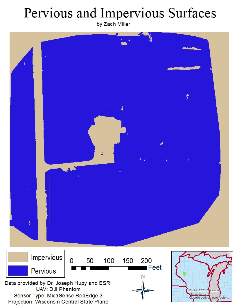
In map 4, areas in blue show pervious (or permeable) surfaces and areas of khaki show impervious (or impermeable) surfaces. Some of the impervious areas near the top right of the map are in fact pervious, but ArcGIS Pro interpreted them as being impervious. This could be due to the quality of the imagery or user error when classifying the segmented imagery. Also, the entire boarder surrounding the image got accounted for as an impervious surface, however this area shouldn't have been included.
Map 5: NDVI raster
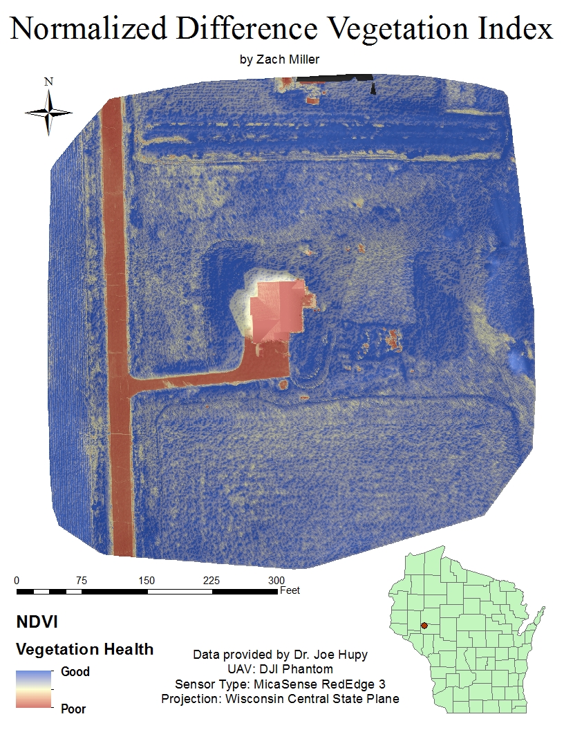
The fifth and final map of this analysis is of course map 5. Because the Ag Multispectral template was used in the image processing with Pix4D, an NDVI raster was produced. With the gradient used for this map, features of the landscape become enriched and areas of poor vegetation health are shown in a rusty red color while areas of good vegetation health are shown as indigo. Over larger portions of vegetation with similar health, such as the southern area of grass, the user is able to see in great detail variances in vegetation health. There also seems to be minimal false interpretations of values in this map with the only real exception being the shadow cast by the house.

Conclusions

It is clear that using the Ag Multispectral template in Pix4D as well as the MicaSense RedEdge 3 sensor is a fantastic option for farmers, biologists, golf course management, and other similar applications. This technology allows the user to really gain an in depth analysis of the health of their vegetation. Set backs to this technology would include the large potential for false information from user error. During the flight that collected the images used for this analysis, the pilot accidentaly had the camera on while the UAV was climbing to its planned flight altitude. Mishaps such as this have an effect on the quality and accuracy of the analysis. If I could do this assignment over again, a potential fix for this mistake could be to eliminate those images from processing altogether. If images from UAV are taken with great care and accuracy and the user completes all the data manipulation steps correctly, this technology has the potential to provide cutting edge agricultural and other vegetation-based information analysis.

Thursday, March 9, 2017

Assignment 5: Processing Pix4D Imagery with GCPs

Introduction

For this assignment the objectives were to further learn about how to process imagery in Pix4D, use Pix4D's rayCloud GCP editor, rematch and optimize the imagery, and merge two projects into one DSM and orthomosaic rendering.

This assignment involved using a lot of the same methods as the last image processing assignment, however this time GCPs were used. A GCP or ground control point, is a physical landmark that represents a known coordinate. These markers are placed at various ground locations throughout the site of study. When the UAS is in flight, it takes aerial photographs of the ground and in those photographs, some will contain GCPs. When the user goes to process the imagery, the ground control points are used to georeference the locations of the photographs, placing the imagery into a coordinate system.

Methods

For this assignment, the two Litchfield flights were processed separately, but the same methods were applied to both. The first step was to process the Litchfield flight 1 photos. The same methods used to process imagery in Assignment 3, were used in this processing. Before initially processing the images, however, a file containing the GCP coordinates was added to the map.

Figure 1: Adding GCPs before initial processing 

Figure 2: Importing .txt file containing GCP coordinates  

Figure 3: Map view after GCPs were added to the map (from Flight 2 processing)
Once this was done and initial processing was complete, the GCPs were tied down using the rayCloud GCP editor. Figure 4 shows the GCP locations as floating blue points in the rayCloud.

Figure 4: Pre-GCP editing
Obviously, floating GCPs aren't exactly what's desired for tying down the images, so the next step was to use the rayCloud GCP editor and match all the floating points with their corresponding GCPs, using the aerial photographs.

Figure 5: Using the rayCloud GCP editor
Once the floating GCP point was clicked on, the user could find the actual GCP in the images containing it and clicked on the center to accurately tie down the floating point to its corresponding GCP, thus georeferencing the images. After all floating points were tied down to GCPs, the project was rematched and optimized. In figure 6 and figure 7, the green points represent the tied down GCP locations. The blue points in figure 7 represent speculated GCP locations that were not found in any of the images during GCP editing. 

Figure 6: rayCloud before imagery has been rematched and optimized
Figure 7: rayCloud view of rematched and optimized project (flight 2)
 When looking at figure 7, the green triangles represent the height and position of the photos from the initial flight and the blue triangles represent the corrected position and imagery after rematching and optimizing. From there, the rest of the processing was completed and the quality report, DSM, and orthomosaic rendering were produced. Then, the same processes were done for the Litchfield flight 2 images.
Figure 8: Summary and preview of Litchfield flight 1 from quality report.
Once both flights were processed, they were merged together by going through yet another full processing. The final result? A fully rendered DSM and orthomosaic of the entire Litchfield mine.

Results

As compared to processing imagery with out GCPs.
Figure 9: Merged DSM Hillshade
Figure 10: Comparison Hillshade DSM
Looking at figure 9 and figure 10, figure 9 shows a little more accuracy in the southwestern and eastern portions of the rendering. In figure 10, there is a bit more distortion in those areas. Both of the southern portions are distorted due to the tree coverage but the area at the cusp of the tree line is less distorted in figure 9 than in figure 10. The hillshade appears more crisp in figure 9 as well.
Figure 11: Merged Orthomosaic Hillshade
Figure 12: Comparison Orthomosaic Hillshade
Looking at figure 11 and figure 12, there isn't too much of a difference in quality. The features in figure 11 are slightly more defined perhaps, however both match up with the basemap quite well and show features accurately.

Conclusions

After processing imagery for the same site, one using GCPs and one not using GCPs, there is only a slight difference in quality. For this imagery, the photos taken already have geocoded locations so there are some things to consider in that regard. Perhaps with a different UAV the results would show that using GCPs is crucial to processing and georeferencing accurately. The only noticeable differences in quality would be in the southwestern and eastern portions of the DSM and the camera optimization in the summary. The areas that got a bit muddy in the non-GCP processed rendering came out more defined and accurate, in the rendering processed with GCPs. In figure 8, the summary shows that the camera optimization had a 0.47% relative difference between initial and optimized internal camera parameters. While the merged quality report showed that the camera optimization was a little less accurate than in figure 8, it was still more accurate than the 5.22% relative difference in the imagery processed with out GCPs.

Monday, March 6, 2017

Assignment 4: Value Added Data Analysis with ArcGIS Pro

Introduction

The purpose of this assignment was to learn about calculating surface imperviousness for spectral imagery. This was done in ArcGIS Pro and by segmenting imagery

Methods

All calculations and data manipulation done in this assignment were guided by ArcGIS Online's "Calculating Surface Imperviousness for Spectral Imagery" course. The first step was to segment the imagery. This involved extracting spectral bands 4, 1, and 3. This pulled the red and blue bands from the original imagery of the subdivision to better see differences in the land surface. Then the extracted bands image was segmented. This involved reducing the amount of spectral and spatial detail in the image, making it easier to classify the surface in the next step.
Figure 1: Segmented Imagery
To classify the imagery, the Louisville neighborhood and segmented images were dragged into ArcMap. The image classification tool was used to draw rectangles over houses, roads, driveways, bare earth, grass, water, and shadows all over the map. These seven categories would become the different classifications for the imagery.
Figure 2: Louisville neighborhood imagery with classes
Next, in order to break down the imagery further, the reclassify tool was used to differentiate man-made and natural surfaces. Man-made surfaces were called "impervious" features and given a value of 0. The natural surfaces were called "pervious" features and given a value of 1.
Figure 3: Impervious and pervious imagery
Next, the accuracy of the classification was assessed by looking at individual accuracy points for the imagery and the ground truth was corrected for the first ten points.
Figure 4: Assessing ground truth
Then, the confusion matrix was computed indicating the accuracy of the data classification. With 96 percent user accuracy, the data is reliable enough to use in the final production of the map. Before making the map, however the area of impervious surfaces must be tabulated and joined to the parcels layer. This computation would be used to assign each parcel within the subdivision a value of either grey roofs, roads, driveways, bare earth, grass, water, or shadows. 

Once the data has been tabulated and joined to the parcels layer, the next step was to clean up any unnecessary fields as a result of the join. Lastly, a graduated colors symbology was chosen to differentiate which parcels represented which surface values defined earlier. 

Result
Figure 5: Impervious area in feet
As shown by the resulting map, this technology could be very useful to city planners, census applications, land surveying, and the list goes on. When the original image was simply an aerial photograph of the subdivision, it is pretty amazing that a map containing impervious area for each segment of the neighborhood was created. Doing the manipulation of the imagery was fairly easy and user friendly as well, meaning that it can be widely accessible and accurately used.

Saturday, March 4, 2017

Assignment 3: Processing Imagery with Pix4D

Introduction

The goal of this assignment was, as the title implies, to get familiar with processing imagery in the Pix4D. Before this was done, however, it was important to understand a little bit about the software and what requirements the software needed to process imagery from a UAS flight.

One of the most important aspects of processing quality imagery in Pix4D is the amount of overlap between the images. According to the Pix4D user guide, the recommended overlap for image processing is 75 percent frontal overlap (distance between pictures taken in flight path) and 60 percent side overlap (distance between photos taken along flight columns).
Figure 1: Sample flight plan that ensures enough overlap
When it comes to snow, sand, and other flat or uniform surfaces, the amount of overlap required increases to at least 85% frontal overlap and 70% side overlap. Once enough overlap is established, initial processing is the next step. Initial processing is a way for the user to ensure that the images will process correctly and accurately. Rapid check is an alternative form of initial processing. This option doesn’t produce as good of a quality initial image as the standard initial process, but can process imagery much faster and is used to ensure that the images have enough overlap to fully process later.

In the instance of this assignment, as well as other projects, Pix4D does have the capability to process multiple flights at once. This actually enhances the accuracy as long as the pilot ensures that there is enough overlap between the two flights and enough overlap within each flight plan, that the conditions are relatively the same, and that the altitude of each flight doesn’t vary too much.

As far as camera orientation goes, if the pilot captures oblique images, Pix4D is able to process them. The Pix4D user guide recommends conducting multiple flights at different altitudes to ensure accuracy. The user would need the distance covered on the ground per image and its direction, the image width, and the desired ground sampling distance.
Figure 2: Flight plan for best processing oblique imagery
Geographic Coordinate Systems are not required for processing imagery in Pix4D, because the images taken from the UAS have coordinates in their metadata. It is recommended that the user inputs a coordinate system when processing imagery due to the fact that this further enhances the accuracy of the image when placing it into a spatial reference.

After the imagery has been processed (either after initial processing or after fully processing), Pix4D will provide the user with a quality report. This report contains information that allows the user to determine the quality and the accuracy of the image processing. This will help the user in determining whether the output images are good enough to use or not.

Methods

In this assignment, images were taken from two separate flights completed at the same site, the Litchfield mine in Eau Claire, WI. The first step was to add the images from both flights into the Pix4D image processing wizard.

Figure 3: Selecting images from both flights
Once the images were uploaded to the wizard, the image properties were examined. In this stage, the camera shutter model was set to "global shutter or fast readout" by default. However, for this assignment, the shutter model needed to be set to "linear rolling shutter".

Figure 4: Editing the camera shutter model to linear rolling shutter
Next, initial processing was ran on its own, before the "Point Cloud and Mesh" and "DSM, Orthomosaic, and Index" processing was done. The reason for that was the initial quality report could find any errors before the second and third steps were ran. This could save the user a lot of time and help ensure that the images were processed accurately.

Figure 5: Initial processing settings
Once the wizard was completed and the settings for processing were established, the initial processing could begin. Upon completion, Pix4D generated the quality report. This report notifies the user of any errors with the imagery and can help the user determine whether or not to follow through with completing the image processing.
Figure 6: Quality report summary
Figure 6 shows the summary portion of the quality report after initial processing was complete. This summary gave details about the file name of the project, date processed, camera model, ground sampling distance, area covered, and duration of the initial processing.

Figure 7: Quality check and preview


Figure 7 shows the quality check and preview portions of the initial processing. 100 percent or all 155 images were deemed usable. A green circle with a check mark in the quality check portion indicates that the parameters for optimal processing quality have been met. The yellow triangle with an exclamation point indicates that there may be a problem with the resolution or quality of the image processing. In this case the precautionary symbols were overlooked as the camera optimization was barely over the minimum optimal limit (<5%) and the georeferencing wasn't vital to the integrity of the image processing (see Introduction > GCS section).

Figure 8: Overlapping images computed for the orthomosaic. 
Figure 8 shows that red areas can result in poor quality processing of those areas and green areas are deemed sufficient for quality processing by having five or more overlapping images. The more overlap the better. 


Figure 9: Map view showing where the images for both flights were taken.  


Figure 9 shows what Pix4D calls a "map view" of the site. This displays the flight path and photograph locations of the flight. These points were also used in the "ray cloud" which is a 3-D interactive model created upon processing.

After fully processing the imagery, a digital surface model (DSM), an orthomosaic rendering, a 3-D interactive model, and a "fly" with me animation were created in Pix4D. The DSM and orthomosaic were used to create maps in ArcScene and ArcMap.

Results

Figure 10: Screen grab of DSM Vertical Exaggeration 

Figure 11: Screen grab of orthomosaic vertical exaggeration

Figure 12: DSM Hillshade


Figure 13: Orthomosaic Hillshade


Figure 14: "Fly" with me animation

Looking at the results, Pix4D truly is an amazing software and can produce incredibly high-quality imagery. A few areas of relatively poor-quality were noticeable near the southwestern and northeastern parts of the renderings. This was most-likely due to minimal overlap in those areas. The DSM turned out great and did a good job of showing the relief of the site. The orthomosaic turned out alright though as well, minus a few problematic areas, and did a good job of showing the surface. The "fly" with me animation didn't turn out as great as expected and, due to the size-limit for uploading videos on Blogger, a lower quality rendering was uploaded instead of a longer and slower flight that would better allow the viewer to overlook the site. The animation is really something though and testifies to the power and capability of Pix 4D.